This is my newest project. The problem was to design a graphic design office in an existing building on the Gonzaga campus. The columns were to remain in place, as well as the windows. After doing some research on the modern office, I decided to focus my design on the use of daylighting. I also researched the presence of nature and the workplace and how we as humans seek out two kinds of environments- prospect and refuge. The idea of prospect and refuge became my concept. Prospect being the area where we go to take a break, it has a view and offers relief. The refuge is a more private space where we go to be alone and work.


 This is the final digital poster I created for the Painterly Space project. This project incorporated hand drawing/drafting skills along with digital touch-ups in Photoshop and the final creation of the poster in Indesign. You can see the parti sketches and inspiration art piece and how the project developed into the concept model and then into the "light moment" which became the focal point of the space.
 I created this concept model as an exploration of light and how it works with different materials. Part of the interest here is created by the shadow alone. My parti sketches helped me in deciding on forms and shapes to use. I think the transparency here is really beautiful. The play of light created by this model was an inspiration to the rest of my design of the painterly space.
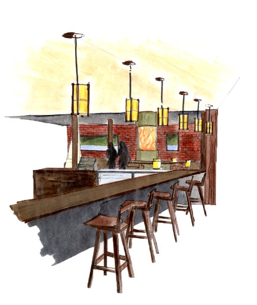
 The final posters turned out well in my opinion. I think that the balance of color was even throughout the nine posters. It is pretty clear what is going on in each poster and easy to read. The hand rendered perspectives also turned out well.